PRL Community Brand Toolkit
Introduction
The brand toolkit contains PRL design components useful to faculty, staff, and students. This page is an extension of Michigan State University's Brand Guidelines and the College of Natural Science's Web Knowledge Base. Its goal is to present a visual language consistent with MSU's and CNS's guidelines but with added custom visual elements that distinguish and reflect the PRL's brand goals.
Why the toolkit?
A brand is perception. More specifically, it’s the sum total of people’s perceptions and experiences - what they think, feel, and respond to when they interact with an organization. And branding is the intentional process of shaping that perception.
Great brands build strong bonds with their audiences by being consistent. They are instantly recognizable, stand for something, and speak a common language, despite the fact that they may speak to different people.
These guidelines are for external and internal communications, including brochures, websites, advertising, invitations, direct mail, postcards, fliers, catalogs, posters, billboards, banners, video, DVD, CD, film, presentations and stationery.
Letterhead
MSU letterhead includes the Michigan State University wordmark at the top and the university seal in the scholar’s margin. All college and department information appears within the scholar’s margin (see example below).
Myriad Pro is the recommended typeface for use on all MSU letterhead. However, the Arial typeface may be substituted if Myriad Pro is not available. Use of the Arial typeface is recommended for letterhead that is sent electronically.
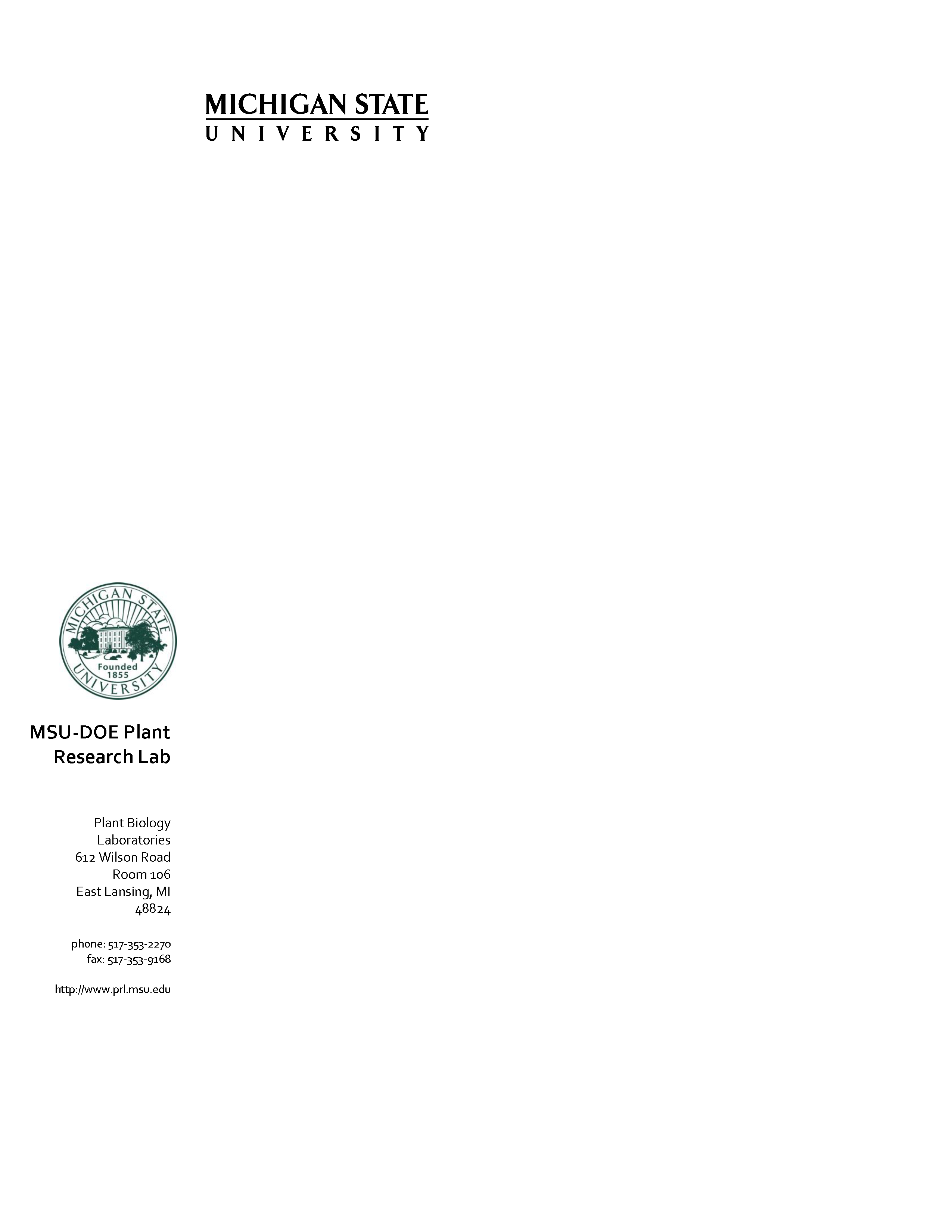 Download the PRL letterhead template.
Get usage instructions.
Wordmark Logo
The PRL uses the MSU wordmark signature as specified by the MSU brand guidelines. The logo set includes color and white versions.
Don't:
- Use other existing PRL logos or create new ones
- Use the Spartan Helmet graphic in PRL logos
Wordmark color logo (preferred)
Note: Download PNG for a transparent background.
Wordmark white logo
Note: The black background is only used to demonstrate the white logo. The download file contain the white logo on a transparent background.

Download
.PNG
Wordmark black logo
Note: Download PNG for a transparent background.
Leaf graphic
Note: This graphic is for secondary use, the wordmark logo is preferred. The leaf graphic should be used only in digital materials. Downloading the JPG will give you a white background. Downloading the PNG will give you a transparent background.
Primary leaf graphic
White graphic
Note: The green background is only used to demonstrate the white logo. The download file contain the white logo on a transparent background.
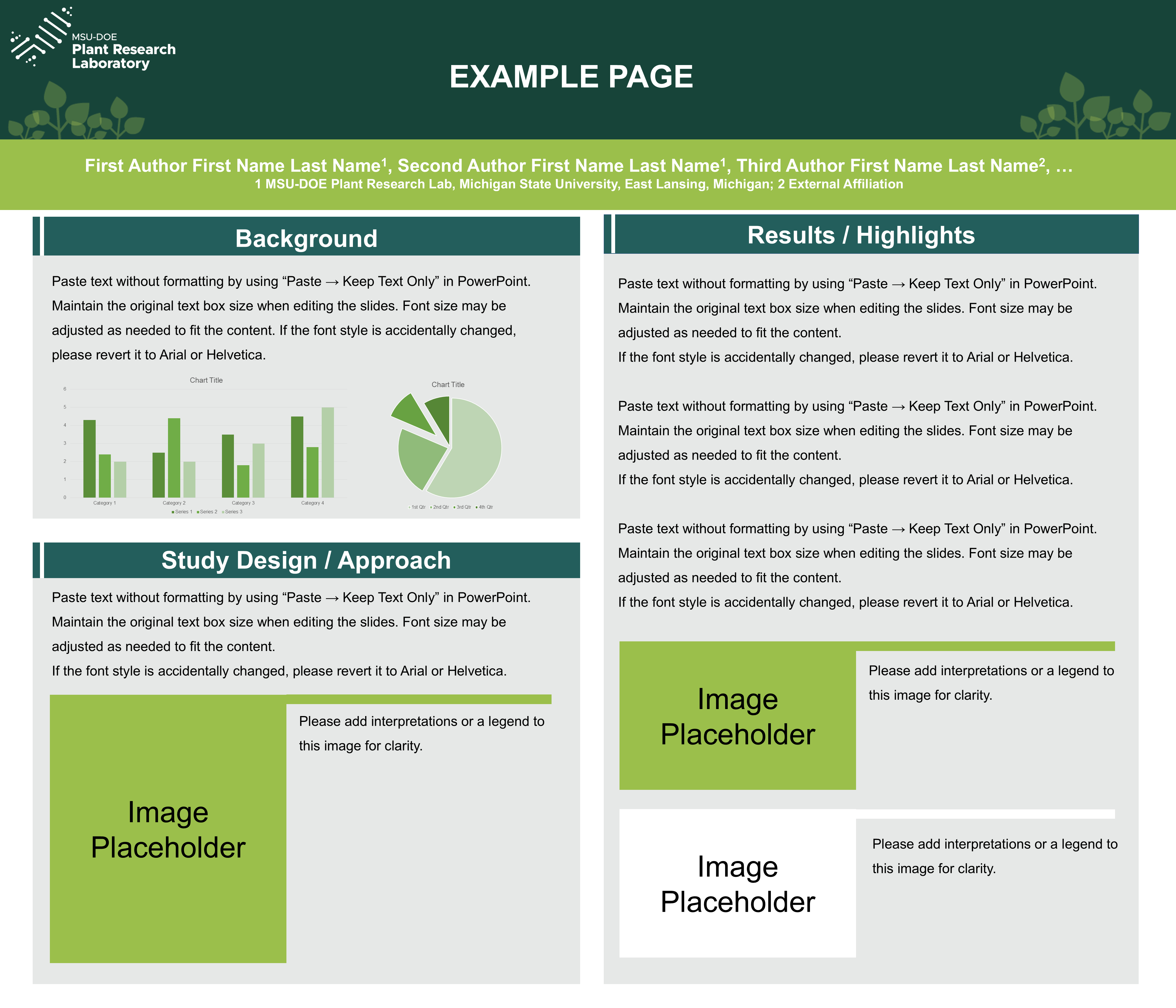
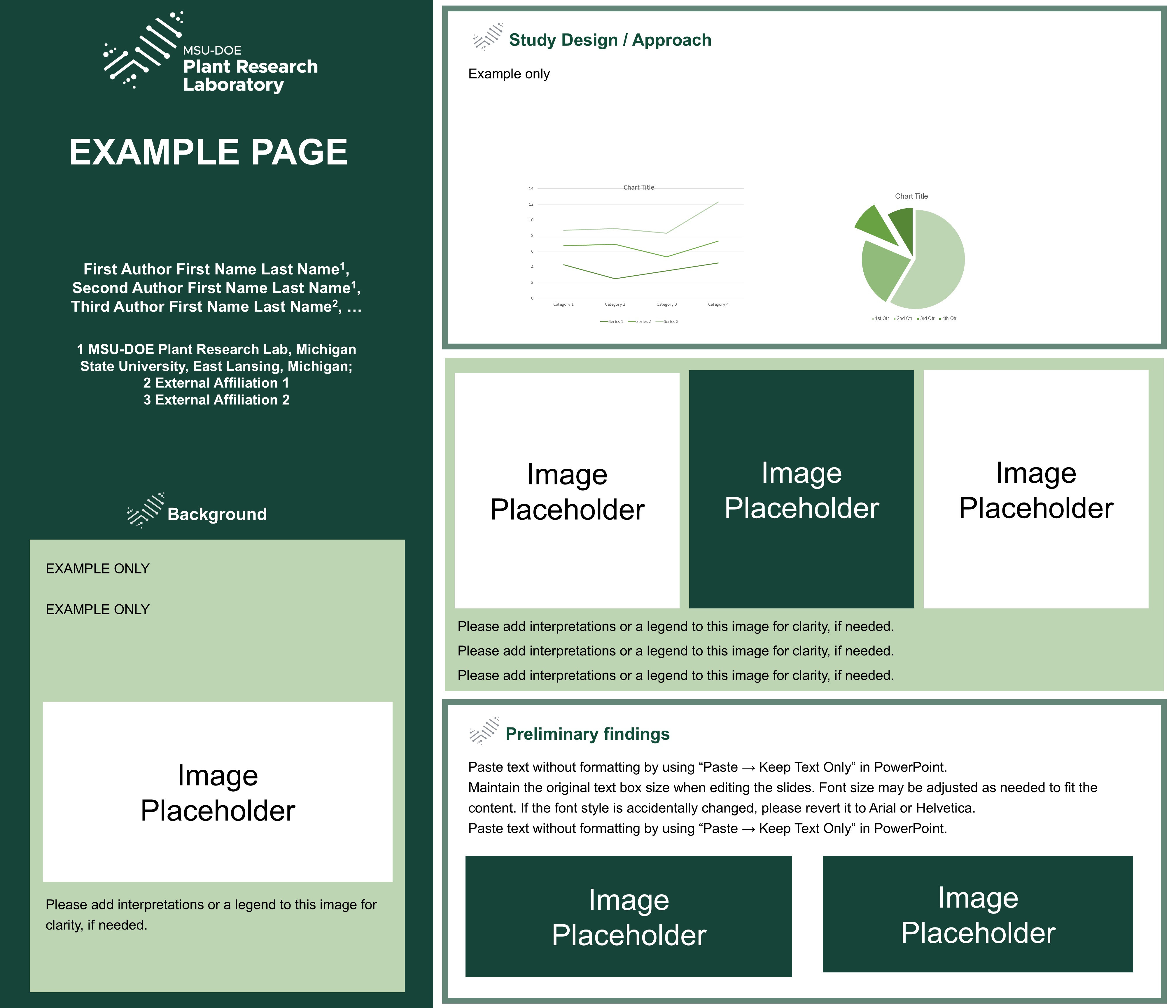
PowerPoint Template
The PRL PowerPoint Template is simple, with ample space for content. It is available in both widescreen and standard sizes. Each template includes:
- Demonstration slides to showcase options, and usage instructions
- Multiple options for title slides
- Customizable areas for media and content
16x9 size
Standard Size
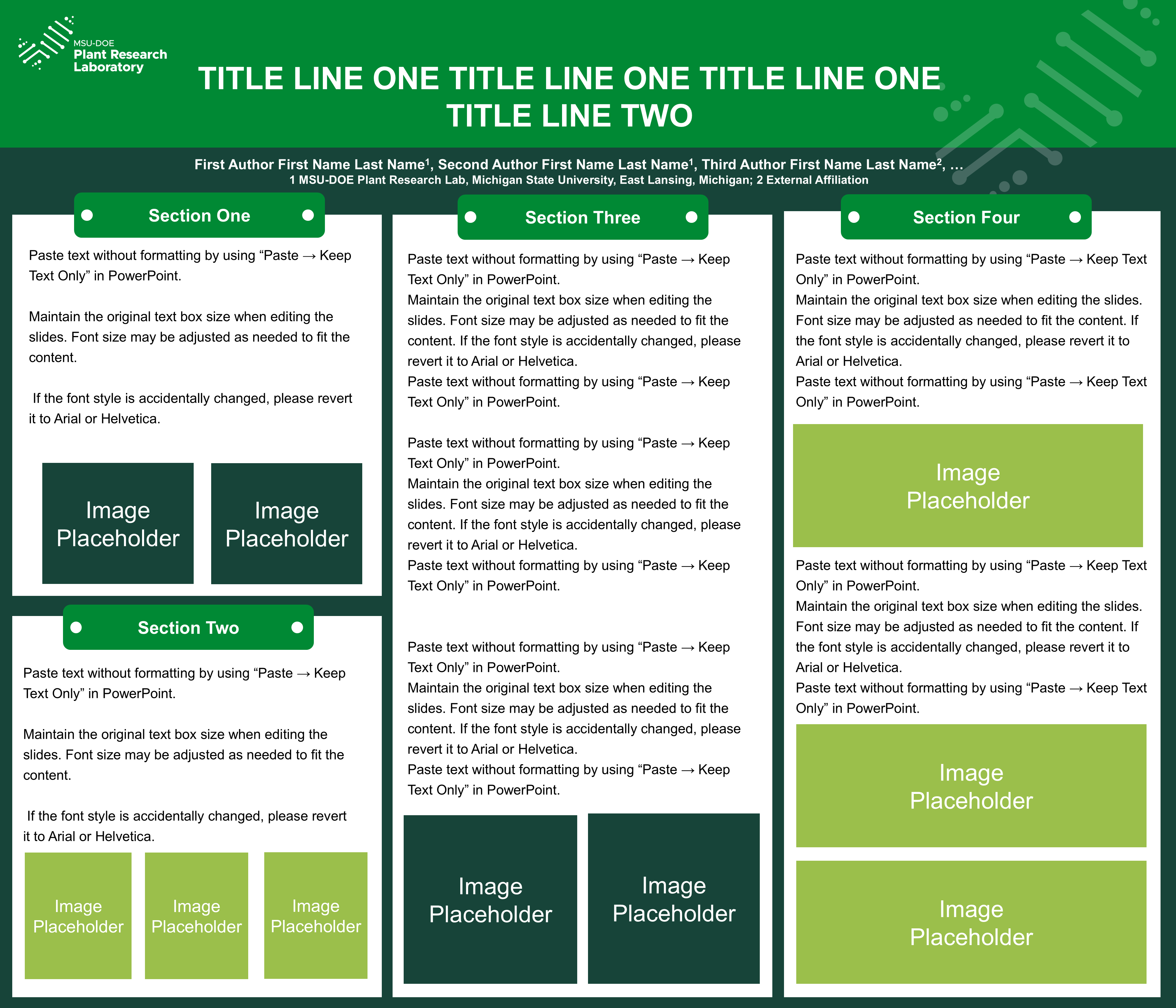
Conference Poster Templates
This poster is designed at 42 × 36 inches (Width: 42, Height: 36). Confirm the size meets any submission or printing requirements before using. Instructions for usage are included in the file.
Typography
Primary fonts
Metropolis (sans serif)
Metropolis is a new brand font for MSU and should replace Gotham as our primary font in all use cases. Approachable, modern, and versatile, yet classic, Metropolis embodies MSU’s open, collaborative, and forward-thinking spirit. Metropolis is the only typeface approved for use in the ‘Part of’ campaign. This is an open font so you can download the font below without reaching out to UComms for assistance. Learn more and download: https://brand.msu.edu/visual/typography.
Liberator (serif)
Liberator is a bold and condensed typeface with a traditional, yet contemporary, appeal. This sturdy typeface will add a striking sense of nostalgia to designs and may be appropriate for certain audiences and communications.
Substitution fonts
These typefaces may be used as substitutes for the primary brand typefaces. Because Metropolis and Liberator are not standard fonts on most computers, the typeface substitutions identified below should be used when creating documents or presentations intended to be shared in their native file formats (i.e., not designed and saved as PDF documents).
- Arial
- Helvetia
- Times New Roman
 Download
 Download